Typeface Design

Being a graphic designer I’ve always been intrigued by type and can often be found sitting in a meeting doodling different characters. I’ve always wanted to design a typeface but have been put off by the huge amount of work required. Doing a search of google resulted in numbers like 150 hours per weight to 9 years per family, enough to put off even the most patient people. Until now (well, about 20 months ago actually).
Concept
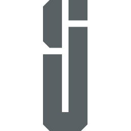
When I first put together this blog i wanted to create some kind of logo for myself, a simple icon. Nothing too complicated, just something I can put in the top left corner that contained my initials S and J. So I pulled out my field notes book and started sketching. After about 30 mins of sketching ideas I had one I was liking so I fired up illustrator and below is what I came up with.

It is this logo that I used as the basis for my typeface. I figured the lines are all straight, no curves, so it should be easier and quicker to create all the glyphs that will make up the fonts of my typeface. Easier? Yes maybe. Quicker? Hmm not too sure about that.
As I alluded to earlier I began to work on this in about July 2016. To clarify, I haven’t been working on it all this time, I initially worked on it about 1 to 2 hours a day each evening for the first couple of weeks then I didn’t work on it for a long time. Basically I’ve been working on it on and off for the last 20 months, most of the time off.
Tools
The next step was to find an application to build my font. Doing some google research came up with a list of common font building apps:
- FontForge - Free - Open source
- Fontlab Studio - $649
- Glyphs - €249.90
As I was just experimenting with typeface design and not knowing whether I will enjoy it and see the process through, I didn’t really want to spend any money. So I went with FontForge.
FontForge
You can download FontForge over at fontforge.github.io. The installation process is quite simple, its a UNIX application so for the mac version, you have to first install xQuartz which FontForge runs inside.
Upon opening Fontforge, it’s quite daunting. There are so many options and tools, if you go in without any tutorials or documentation you could easily get lost. But there is a good guide available over at designwithfontforge.com. It goes through the process of building a font in general then associates each step with how its done in font forge. I won’t go through all the steps, you can read the guide yourself.
If I had to do it all again I wouldn’t use FontForge. Don’t get me wrong, as a free application, its great. You get to build fully functioning fonts at no cost, just your time. But it is buggy. It has crashed many times, freezes often, dialogues go missing so I have to force quit and restart. When it does work, which is most of the time, it seems quite good. Great work by the people who have built it and made it available for free.
I will continue to finish my typeface with font forge now but if I go on to design more typefaces then I will probably purchase a different app. Paid apps usually have a free trial so will give Glyphs a go first.
Time
So why does it take so long to design a typeface. For all you graphic designers out there, think about when you design a new small icon for a project. This is basically what you’re doing with typeface design. Each character is like designing a small icon and there are a lot of characters. There can be hundreds of characters in a font. You have to make sure each character works well with the others. You have to give each glyph a default kerning then adjust for different pairs of glyphs so that the gap between them works. A common example of glyphs that need adjusting as a pair is AV.

If we leave the default kerning for this pair, the space between them will look too big compared to other characters. So we have to adjust. I don’t think there is a science to this, its simply adjusting until it looks and feels right. A mistake I made on my typeface was I started kerning pairs as soon as I had created the glyph. I later read that this should be left until all glyphs have been created then adjust only whats needed.
My Typeface
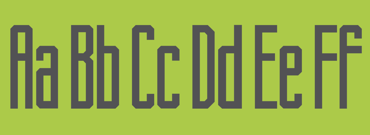
As of writing I’m close to completing the first weight, regular, for my typeface, a preview of which is shown in the banner image for this article.
I have about 10 more diacritics to make, then its time to start testing. My hope is to make 2 more weights, a light and a heavy. I wasn’t planning on adding more weights but I decided I will try to sell the font. With the amount of time it takes to make a font I think its only fair I get a little compensation for it. So if I’m going to sell it, I will need a more complete family. I’m hoping the other weights won’t take as long to make, I simply have to adjust the points for each character.
Stay tuned, I will hopefully be back soon to announce the release of my first typeface.