CSS Grid
It’s been just over a year now since we first got support for CSS grid, that was in Firefox. I’ve put off learning much about grid because many of the projects in my day job need to support older browsers. Now that grid is supported in all major browsers, it’s about time I learnt.
Learning Grid
If you’re looking to learn grid, Rachel Andrew has put together some great video tutorials over at gridbyexample.com. She goes through all of the basic concepts with good, easy to follow examples.
Once I had gone through the tutorials I figured its time to practice so I decided to convert some of this blog into grid layout.
Main Layout

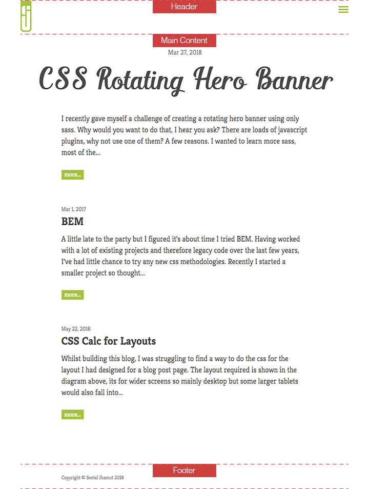
I didn’t think there was any advantages of converting the main layout of the blog into grid. As the image above shows, it’s a very simple layout, header, main content and footer, all vertically stacked. This is the same for any screen width or device.
Article List and Blog Posts
What grid would be useful for is each article in the list, and the blog post page.
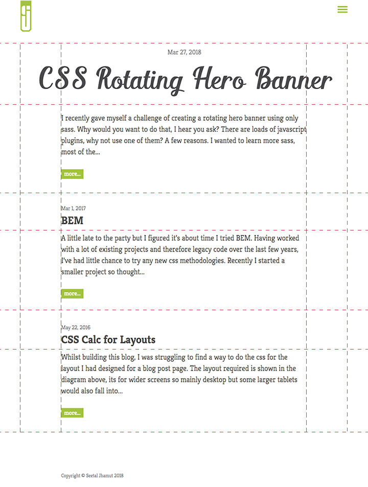
Each article in the list had a width of 100%. The header for the first article had a width of 60em and margin auto so it would be centered. The header for each subsequent article had a width of 45em so it is the same width as the article content which are also both centered. These have been kept to a fixed width for readability, a long line length makes it more difficult too read content. If lines are drawn on this layout, it basically creates a grid as shown below. So now I simply need to convert this to grid.

Code
<div class="postList">
	<article class="homeArticle firstPost">
		<div class="postHeader"></div>
		<div class="postContent"></div>
	</article>
	<article class="homeArticle">
		<div class="postHeader"></div>
		<div class="postContent"></div>
	</article>
	<article class="homeArticle">
		...
	</article>
</div>
.homeArticle {
display: grid;
}The above css turns the article tag into a container for the grid. What this means is any direct children of the article will become grid items. So in this case that means the .postHeader and .postContent divs will become grid items. Only direct children will become items, any elements within the direct children will not be effected by grid.
Next we create the grid lines to which we will attach the grid items.
.homeArticle {
	grid-template-columns: 1fr 7.5em 45em 7.5em 1fr;
}
This basically creates 5 columns. 45em being the central column which is the width of the content. The 7.5em columns on either side are for the extra width of the first articles heading. The 1fr is for the remaining space.
Fr is a new unit for grid, fraction. How this differs from other units is it divides the given space into fractions. So if we had a grid with a width of 1000px and you chose 2 columns of 1fr 1fr, you would get 2, 500px columns. If you had 2 columns of 4fr 1fr you would get 800px and 200px. The good things about fraction is it divides the available space. So for my blog list, we have fixed width values for 3 columns, 7.5em 45em 7.5em. With the grid container, .homeArticle, being 100% width, the remaining space will then be divided by 2 for the 1fr columns.
Next we need to attach the items to the grid lines.
.firstPost .postHeader {
    grid-column: 2 / 5;
    width: 100%;
}
.postContent {
    grid-column: 3 / 4;
    grid-row: 2;
}
When I created the grid-template-columns, 5 columns and 6 column grid lines were created. 1 being the first line on the left of the first column and 6 being to the right of the the fifth column. What the above css does is attach the .postHeader for the first article to grid line 2 and end at grid line 5. That will span the 7.5em 45em 7.5em columns. For .postContent it is the width of the middle column, 45em.
The grid-row: 2; places the .postContent in the second row under the heading.
And we have a grid layout!
The blog post page is basically the same layout as the .firstPost article on the the list page so was followed the same css.
Much More
What I’ve shown above is a basic grid layout. There is much more to grid but I wont go through it all, there are plenty of good resources out there to learn.