CSS Calc for Layouts

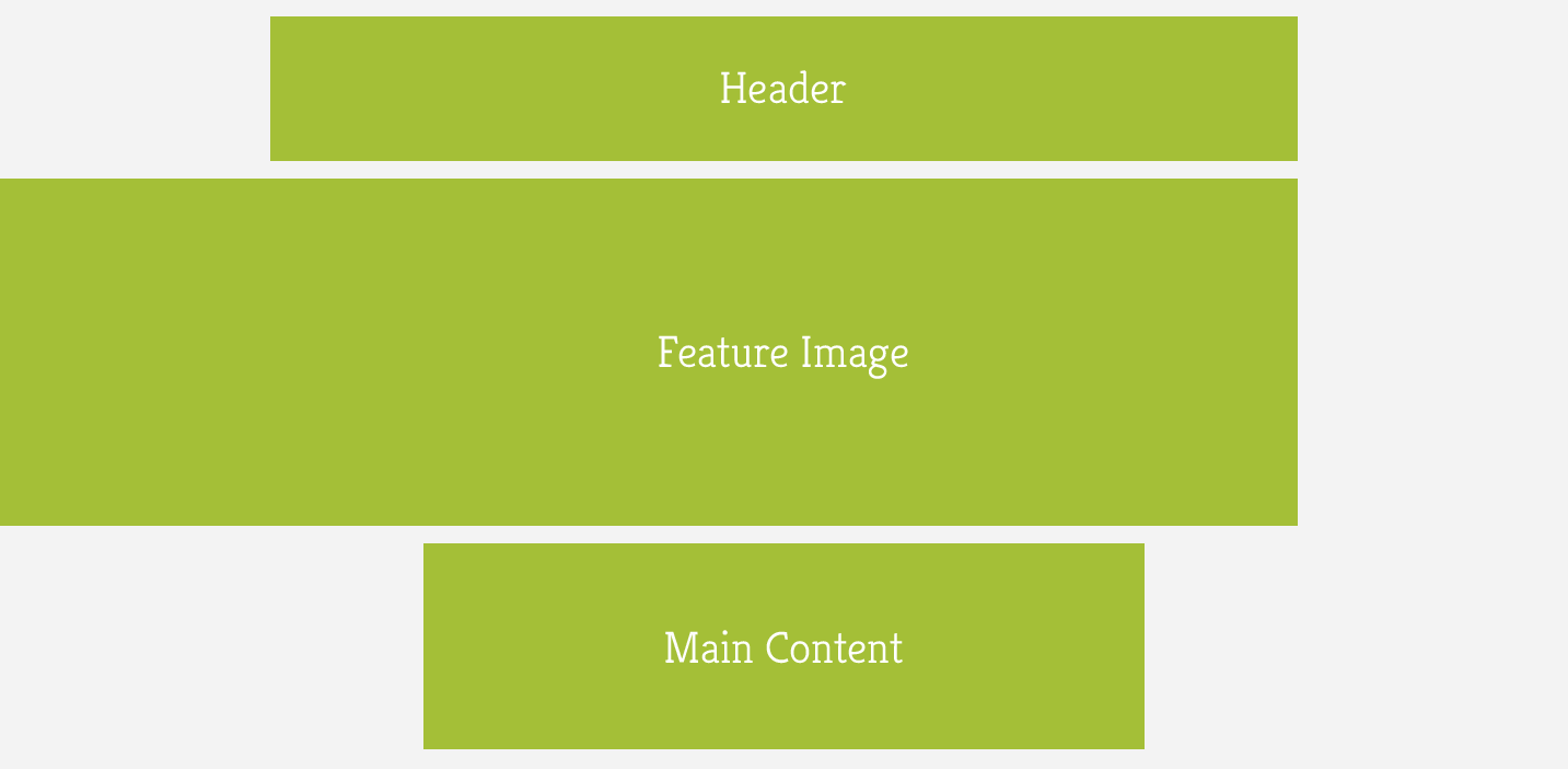
Whilst building this blog, I was struggling to find a way to do the css for the layout I had designed for a blog post page. The layout required is shown in the diagram above, its for wider screens so mainly desktop but some larger tablets would also fall into this range.
The requirements were:
- Fixed width header and centered.
- Fixed width content (so I can easily control line length for readability), also centered.
- A feature image which is aligned left but comes out as far as the right edge of the header.
This would be easy if the header and content was a percentage based width, I would simply have to make the width of the image equal to the width of the header plus the left margin. But with the header being fixed width, the width of the left and right margin will vary depending on viewport width.
CSS calc to the rescue
CSS calc is really cool! It basically allows you to do calculations in css, I won’t go into the intricacies of it, instead I’ll direct you to an article at CSS Tricks where some good use cases are shown.
With calc my layout problem was easily fixed, all I had to do was:
- Minus the width of the header from the width of the viewport
- Divide that value by 2 to get the width of the margin on the left of the header
- Add the width of the header to this value
((viewport width - header width) / 2 + header width)
The final css is:
.featureImageWrapper {
	width: calc((100% - 60em) / 2 + 60em);
}
Calc is supported in all modern browsers including ie9 and above. For a more detailed breakdown head over to the caniuse page.